TierPoint
Logo and Brand Standards
TierPoint is a premier provider of data center services, offering cloud computing, colocation and managed IT services. After merging with one of our existing clients, Suddenlink, Atomic Wash was tapped to handle their rebranding efforts. TierPoint’s existing logo lacked the energy of the Suddenlink brand and so, we were asked to create a brand with personality- one that could bring a friendly and approachable attitude to a technology company.
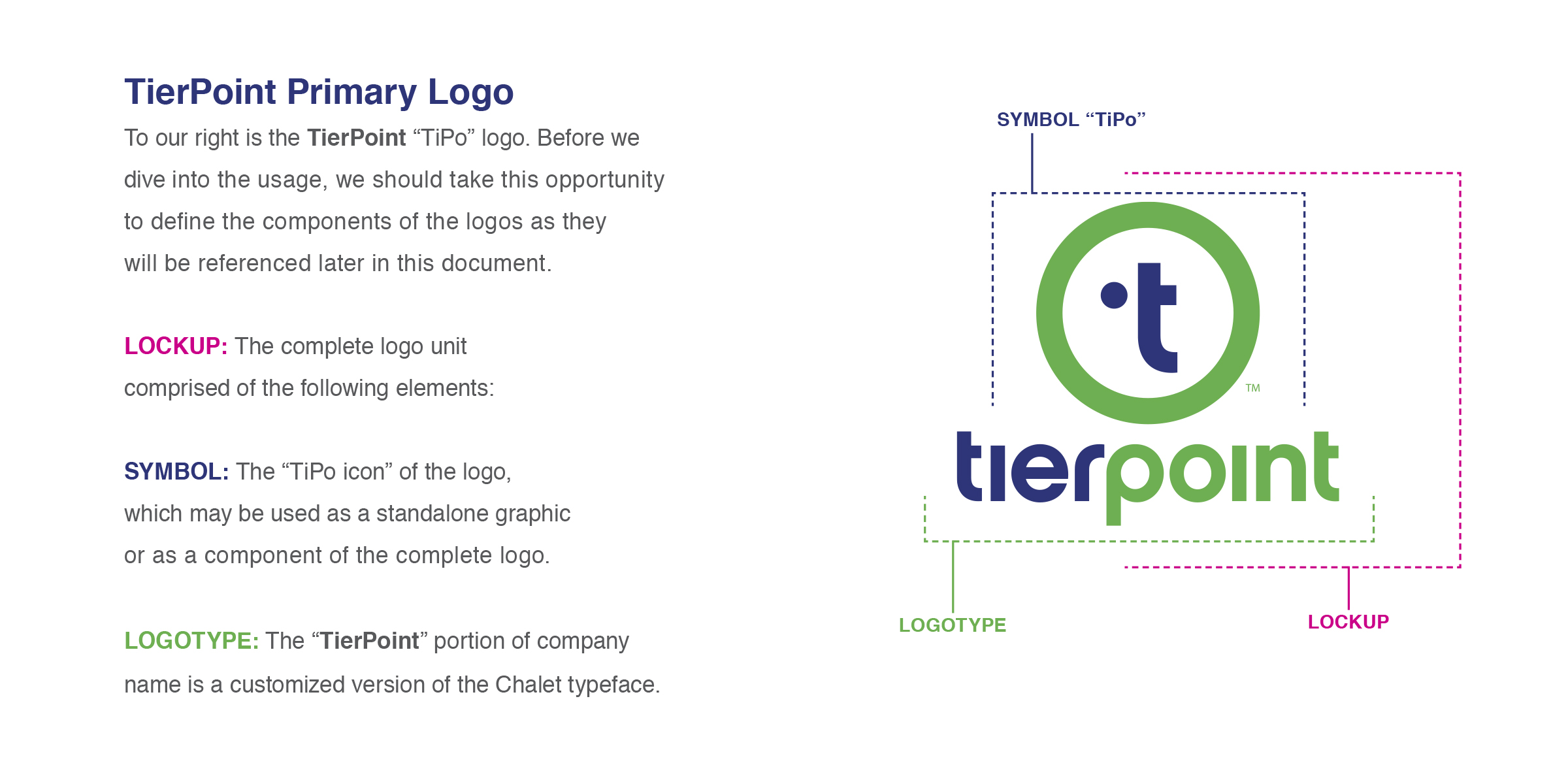
Atomic Wash did what we always do best, put pen to paper, and marker to whiteboard to get things started. We sketched and worked as a team to solve this branding challenge. Ultimately, the notion of “putting a friendly face on IT” really resonated with us, so we did exactly that by creating, TiPo, the new symbol for TierPoint.
As humans, we seek out and recognize faces quite easily. We even have portions in our brain dedicated to this specific function- called the Fusiform face area of the temporal lobe. Leveraging that instinct, we designed a symbol as of once an abstract face, a closed loop, which signifies security and strength, and the letters “IT” for Information Technology. When paired with a customized typeface, it was a home run.
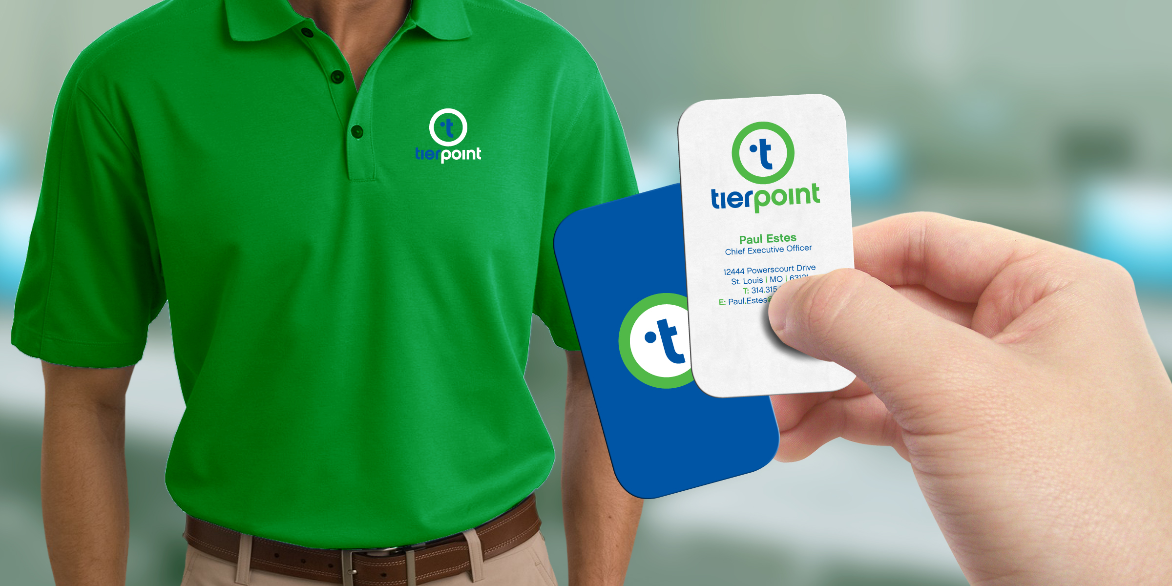
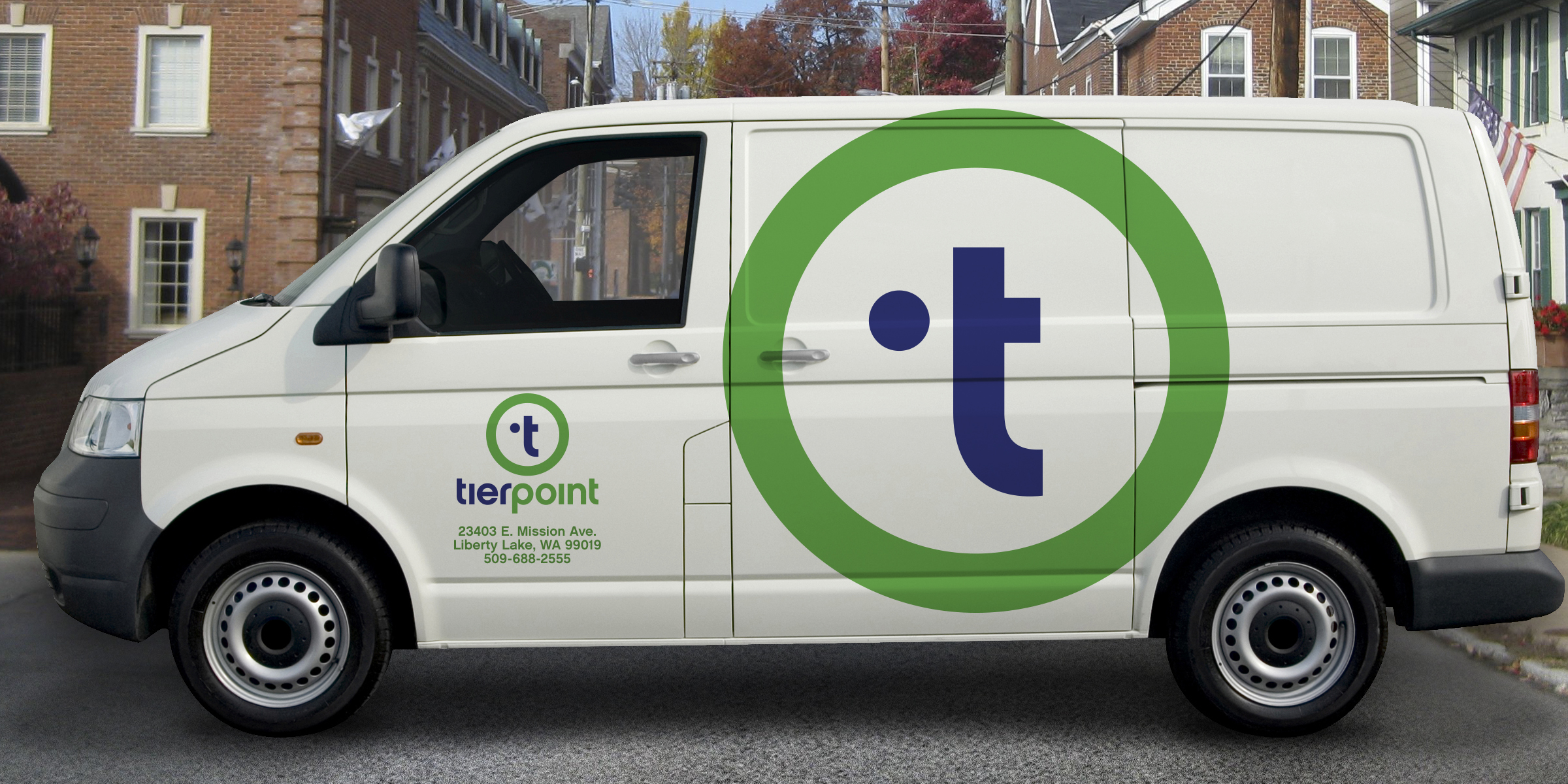
Across all planes of media, to signage, vehicles and uniforms, the TierPoint logo has been transformational for the company, elevating their brand and standing out from their competition in a unique and memorable way.
Services
- Web
- Strategy
- Marketing
- Critical Communications


