SAMI HEALTH
Brand Identity
SAMI (Smart Access to Medical Information) Health provides advanced index search technology to empower easy, real time, cross platform access to information when, where and how its needed. The company was incepted from a personal medical tragedy that led to a unique partnership between SAMI Health and Yale New Haven Health System to address the fundamental challenges that beset all Electronic Medical Record systems.
In 2008, Sam Rakowski passed away due to a series of issues that related to the difficulty getting real time information out of EMRs during the care delivery process. The result was a unique collaboration between Bridgeport Hospital, a member of the Yale New Haven Health System, Sam’s son Rich Rakowski and a group of dedicated clinicians and software engineers. Their goal was to find a way to make the EMR an active participant in the care delivery process. The result is SAMI – the first truly cross-platform, user-friendly and real time system that transforms existing EMRs into active partners in care delivery.
Being a start-up at the time, SAMI Health had ZERO marketing and needed help. Atomic Wash came to the rescue.
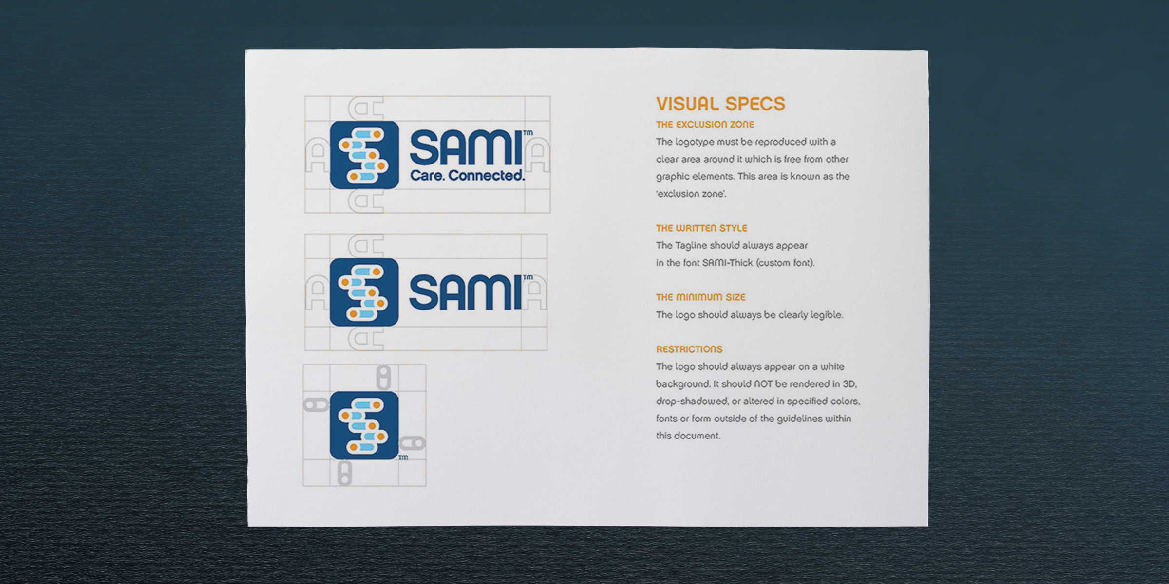
They tasked us with developing the branding for this innovative healthcare company. When we set out to create the logo for SAMI it was difficult because we believe in simplicity and the value in breaking down the systems process/functions into its simplest form. After some false starts, we landed on a basic symbol that can translate easily into an iOS and Desktop Icon. We incorporated oblong shapes that represented the data and the ‘switches’ that comprised the user interface.
The logo garnered great success and the organization handed us our next project, designing the user interface. After a strong pilot program, Navigant acquired SAMI Health in 2013.
Services
- Logo & Identity


