NRC
Branding
Atomic Wash was introduced to the National Recycling Coalition (NRC) through ReCommunity, who were board members of the 6000+ member organization. NRC, a non-profit 501(c)3 focused on promoting and enhancing recycling in the United States, was in desperate need of a brand overhaul. They felt their existing logo and branding did not properly reflect the NRC and its clear benefit to the industry and to society as a whole. They also wanted their logo to tell more of a story and be authentic to the spirit of the brand.
Inspired by other work we had done in the recycling and sustainability marketspace, the NRC team turned to Atomic Wash to lead this rebranding effort.
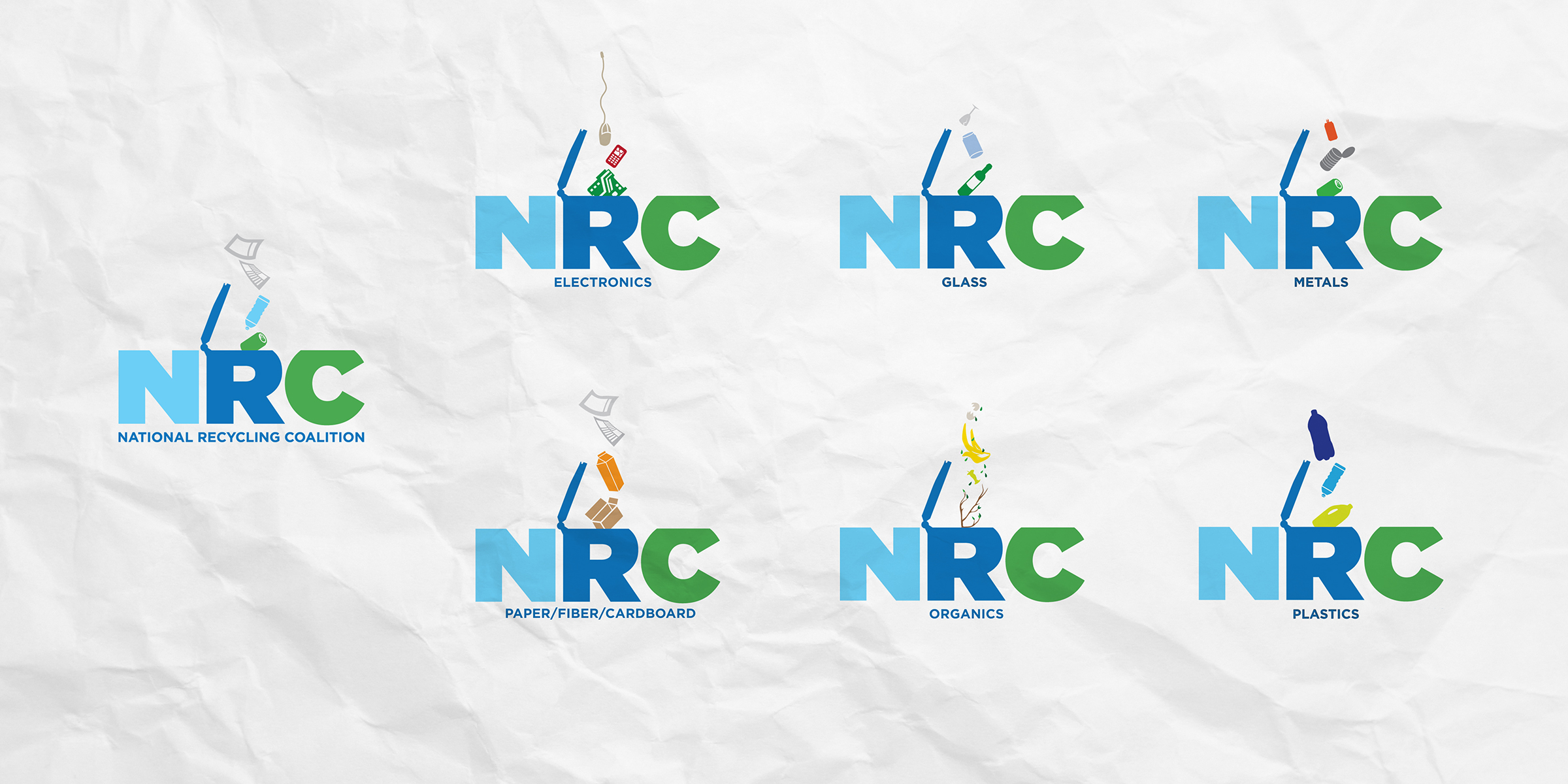
We started from a clean slate, working diligently to avoid all of the typical and overused premises of recycling logos, such as the recycling Moebius symbol. We knew it had to be unique in order for it to achieve our goal of representing the many facets and trade categories of the organization. To fulfill this objective, we developed a logo that utilizes the “R” in NRC as a recycling cart and incorporates the act of items being dropped into the top of the cart. In conjunction with the standard logo, we developed a supporting logo schema that allows the NRC to be category specific and customize the logo for different events, meetings, presentations, etc. The schema enables NRC to change stream of objects in the logo to reflect different categories of recycling and sustainability, such as single stream recycling, electronics, metals, glass and plastics.
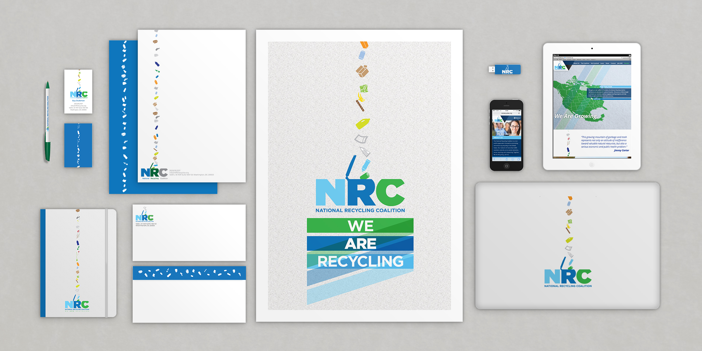
NRC immediately adopted the new brand identity and it is currently being used on their new website and marketing materials. It has received positive feedback from all stakeholders and helping to build stronger brand awareness for the NRC.
Services
- Logo & Identity
- Web Content Strategy
- Web Design


