RECOMMUNITY
Brand Development
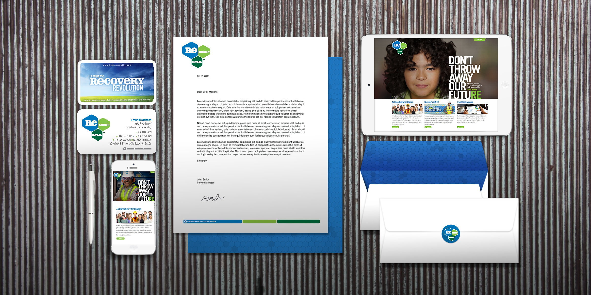
ReCommunity, a pure play recycling company that works with communities to recover discarded natural resources and convert them into new products came to Atomic Wash in crisis mode. It was one week before their public launch and they still didn’t have a logo, and they needed one, fast. A challenge indeed, but Atomic Wash is no stranger to proverbial fire drills. With ReCommunity’s mission, vision and values in mind, Atomic Wash designers diligently brainstormed ways to illustrate the company and their desire for community partnerships.
Services
- Over All Brand
- Brand Content Strategy
- Logo & Identity
- Critical Communications
- Photography
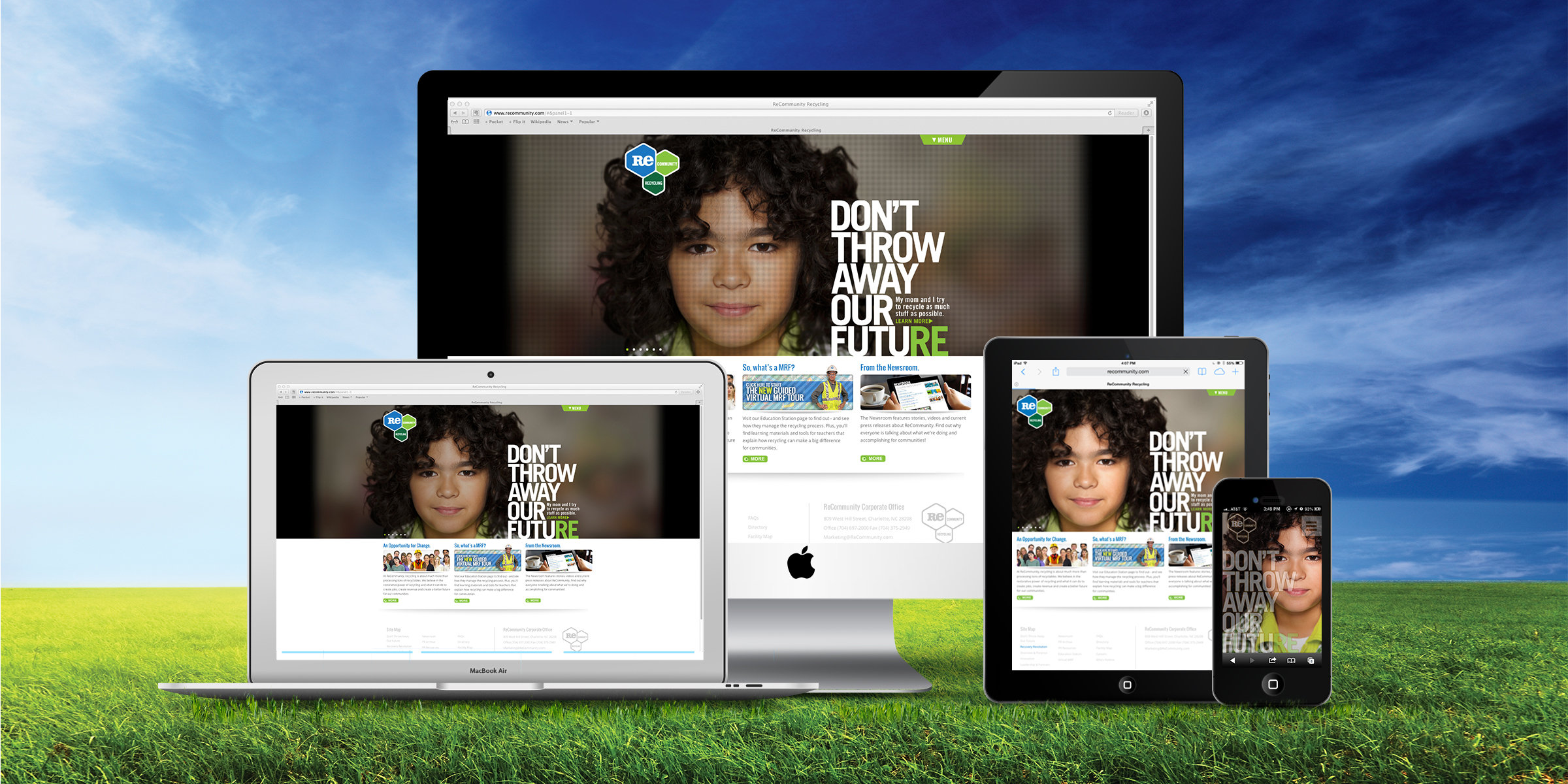
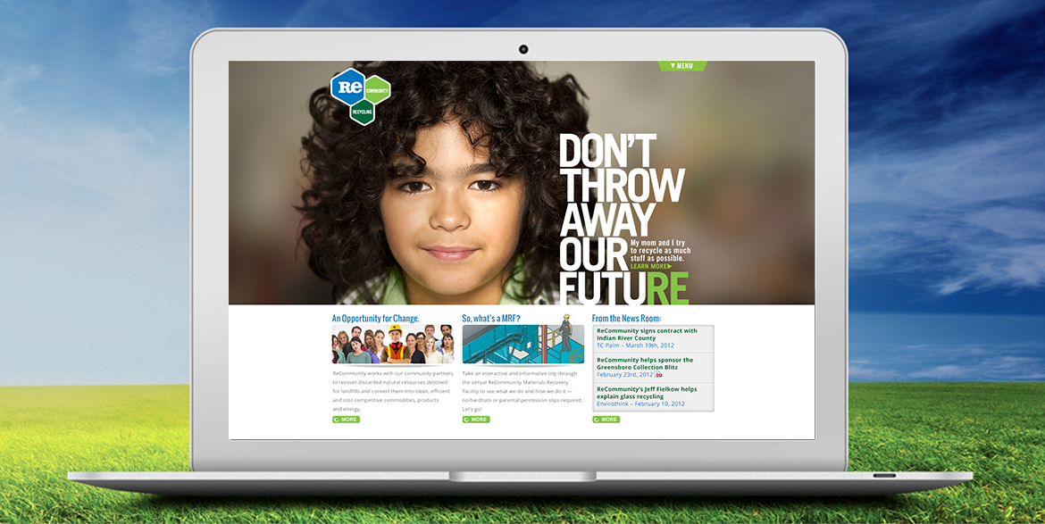
- Website
- Web Content Strategy
Foundation of the Brand
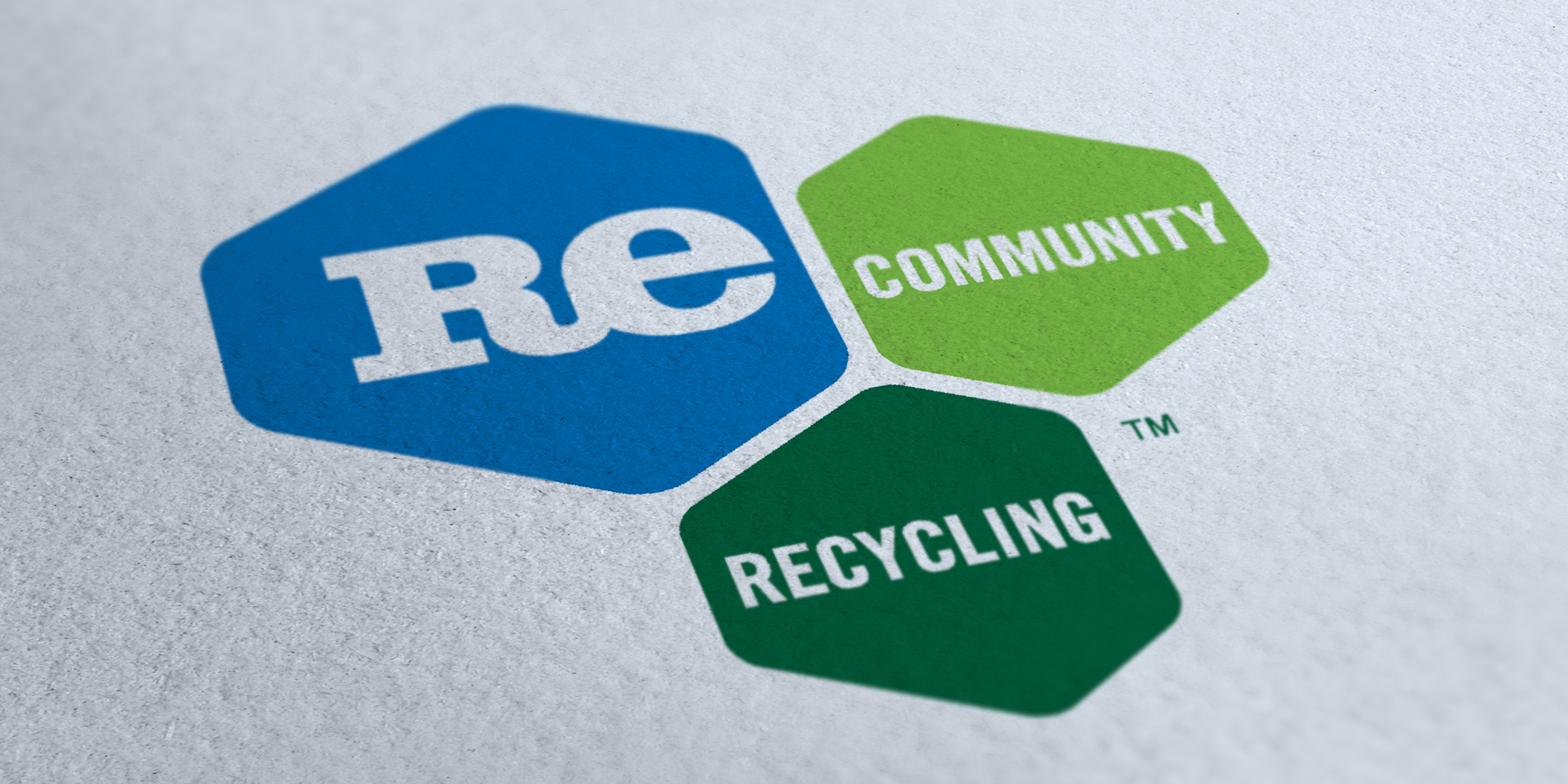
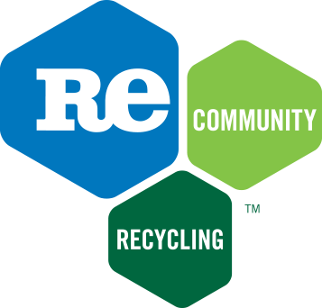
What came to be was a singular logo with three hexagon components, each one representing a carbon molecule. The first component, “RE” was chosen to represent the company’s ability to give new life to resources that were previously destined for landfill. The second “Community” component was a critical choice as it reinforced the company’s primary mission to supporting communities and community growth, around the country. The third hexagon was the “Recycling” component which of course, reinforced the focus on recycling. However, the idea was that the third hexagon would be customizable, and as new communities signed onto work with the ReCommunity, a personalized ReCommunity logo would be created by inserting the community name in place of the word recycling.
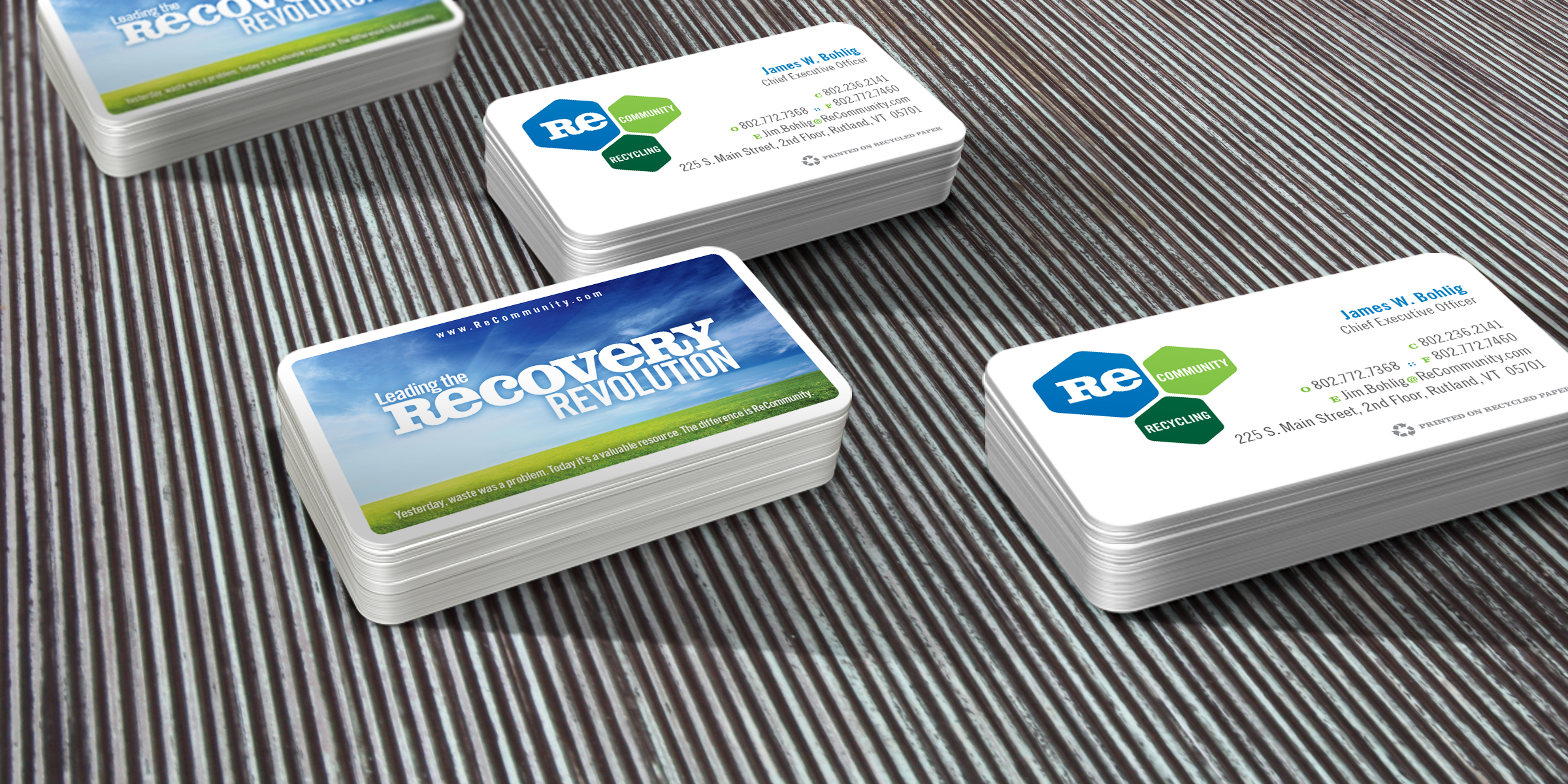
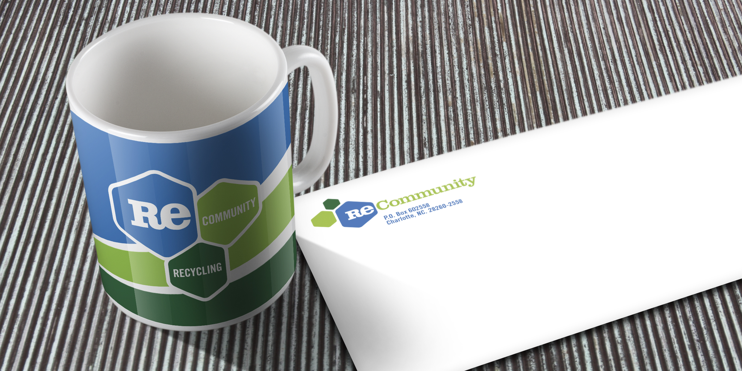
The Logo system/schema met with overwhelming success and was immediately become an iconic stamp representing the ReCommunity brand and recycling awareness. It addition, using the adaptive logo has truly been able to help communities promote recycling and integrate the ReCommunity mission into the communities they serve.
Educational Resources
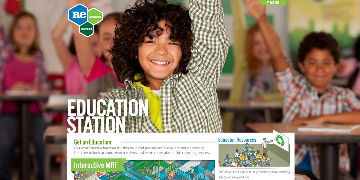
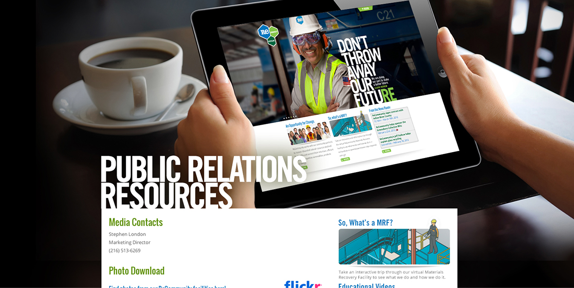
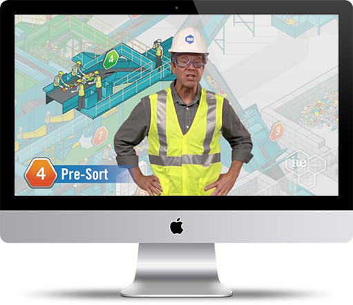
As a company that truly believes in the importance of recycling, ReCommunity offers student tours at all of their facilities. They looked to Atomic Wash to ensure they delivered the best possible presentations and materials to educators and students. We created a multi-tiered approach that provides students and teachers print materials, online materials and both guided and self-guided virtual tours of a ReCommunity Materials Recovery Facility. These tours are available for viewing at ReCommunity MRFs and can be accessed on the company website.
MRF00 – ReCommunity – Virtual MRF Tour – Full Length Tour from Atomic Wash on Vimeo.
[/ultimate_modal]
ReCommunity – How Recycling Works from Atomic Wash on Vimeo.
[/ultimate_modal]
ReCommunity – The Recycling Process from Atomic Wash on Vimeo.
[/ultimate_modal]
ReCommunity – The Recycling Process from Atomic Wash on Vimeo.
[/ultimate_modal]
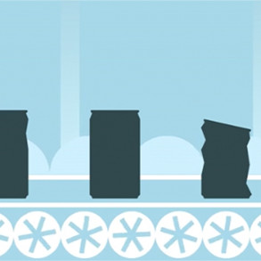
ReCommunity – Recycling Plastic from Atomic Wash on Vimeo.
[/ultimate_modal]
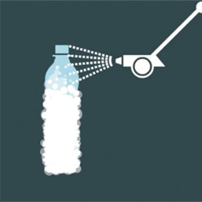
ReCommunity – Recycling Cartons from Atomic Wash on Vimeo.
[/ultimate_modal]

ReCommunity – What happens after curbside pickup? from Atomic Wash on Vimeo.
[/ultimate_modal]

ReCommunity – What happens after curbside pickup? from Atomic Wash on Vimeo.
[/ultimate_modal]
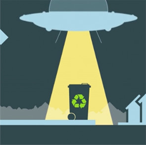
ReCommunity – Recycling Paper from Atomic Wash on Vimeo.
[/ultimate_modal]

RFP Solution
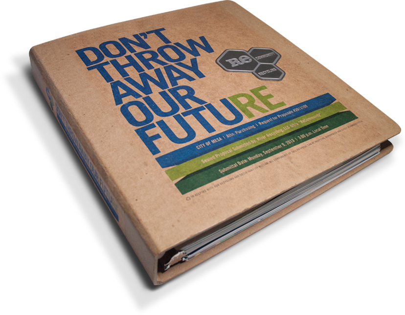
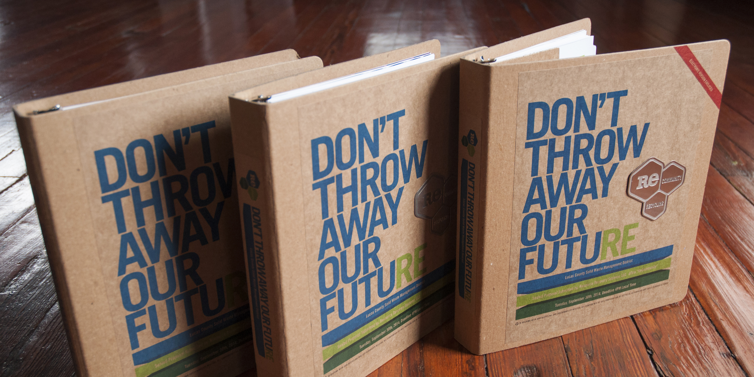
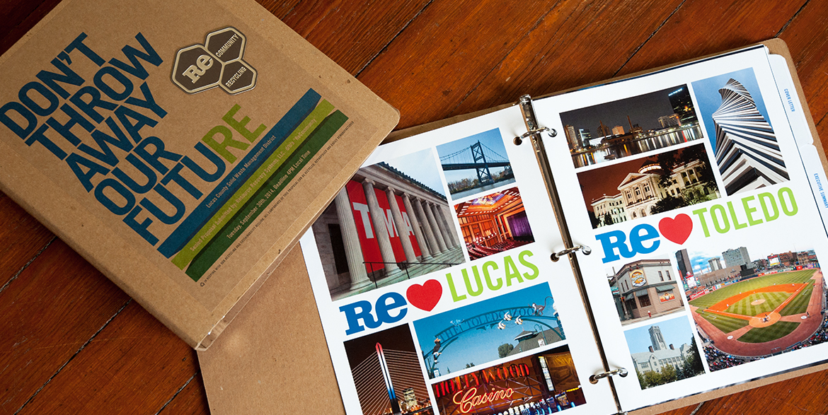
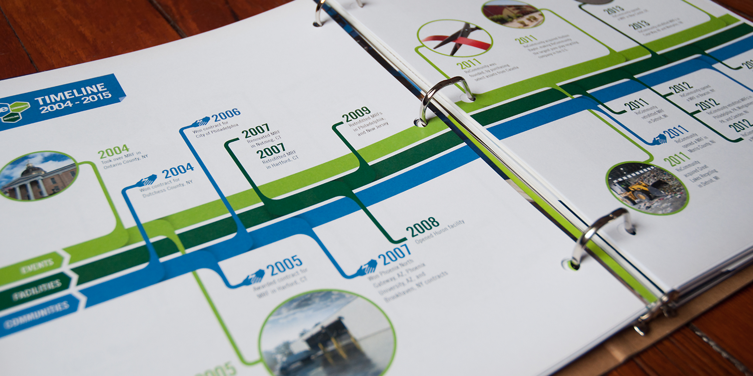
When a company depends on the RFP process to succeed, they need a foolproof formula to continually produce winning RFP presentations. ReCommunity, Atomic Wash’s pure-play recycling client turned to us to create a template that could be used as the foundation for all of their RFP responses.
The result is a flexible, customizable format that can be tailored to fit the exact requirements of the RFP. In addition, we built in the ability to package the RFP as a hardcover book; a spiral bound book or a 3-ring binder. Our design has continually been praised and has helped win the company numerous projects.
